Overview
May-June 2021A growing skincare professional, MK Estheticss started its foundation on its social media content and is in need of creating a new digital product to optimize the user experience and create an aesthetically looking brand.
-
Roles
UX Design
Visual Design
Brand & Identity
-
Deliverables
User surveys & Interviews
Competitive Analysis
Personas
User Stories, Site Map, & User Flows
Brand & Identity
Wireframe & Mockups
User Testing & Design Iterations
-
Tools
Figma
Adobe Illustrator
The Problem
Users could not complete scheduling appointments without wasted time and energy in back-and-forth communication. No woman has time; most of us are busy. am I right? MK's users needed crucial information about her services. And needed strengthening brand & identity.
The Solution
Cutting out back-and-forth communication and getting to the point of scheduling an appointment with ease. Do you see a service you want? Book it! Providing a needed identity that matched my client’s core values. Content is the main factor, it’s how you gain trust, and with MK Estheticss close to your face, you want to know all the Informational content about the brand and service before deciding on booking an appointment. They go hand in hand.
Discovery
Stakeholder Interview
It all begins with an idea. Maybe you want to launch a business. Maybe you want to turn a hobby into something more. Or maybe you have a creative project to share with the world. Whatever it is, the way you tell your story online can make all the difference.
Don’t worry about sounding professional. Sound like you. There are over 1.5 billion websites out there, but your story is what’s going to separate this one from the rest. If you read the words back and don’t hear your own voice in your head, that’s a good sign you still have more work to do.
User research
Who is our target audience? I conducted surveys and interviews to identify our target audience, pain points, opportunities, insights, and get to know our users. We knew the business had more clientele so we left our survey link on MK’s Instagram page hoping to get as many users as we could. Started with 8 and a total of 18 users responded.
Age?
How did you hear about us?
How do you book appointments with MK?
How long have you been using our services?
How often do you use our services?
Interviews & insights
It’s very important to ask the right questions in order to find the problems and where she is excelling. Relaying the urgency to my client, in how crucial it is to be user motivated to enhance her business. How can we improve our services? If we had an App or website what would you like to see or added features? Tell me about your experience at MK Esthetics?. Here are some User statements.
What are their needs/likes
• Being able to book with prices & services
• Price menu
• I would like to see a calendar of the openings
• Customize services
• Easy to use app or website
• Videos
Pain points
• Users are experiencing delays on confirmation to appointments
• Lack of quality
• No information in detail about services
• No schedule system
• No prices posted
Competitive analysis
To keeping the balance of business goals and users, how can we brand her services better? How can we differentiate MK from others, I looked at her competitors. We need to be able to differentiate and where we can learn. I chose primary, secondary and tertiary. To an equal and to what the product can be in the future. Getting to know each one’s product and services, are they using apps or websites? Booking appointment systems? Listings of their menus? Since I'm branding, I needed to look at other features like logo, color palette, tagline, fonts, imagery, and positioning.
Takeaways & thoughts
MK is exceeding expectations with in-person services, but users still lack in painful areas.
The surveys suggest we give the users content about services, booking system. MK Estheticss social media is getting a lot of traffic but only for direct messaging to make an appointment and looking at posted pictures.
• 98% women.
• 77.8% of users used Instagram to book their appointments.
• Client was gaining new customers 44.4% just started using her services.
• Competitors gave me insight into their booking schedules, their branding style, and where we can be different and excel in major areas in order to be a competitive force in the business.
User personas
I noticed patterns in users’ perceptions and tasks and aggregated my findings in the form of a persona based on my research.
Name: Crystal
Age: 28
Occupation: Full-time receptionist
Status: Married
Bio: Crystal is married, with one child and works hard for her family. She’s busy with day-to-day tasks, being a mother and wife. She still maintains to upkeep her looks, regardless of her lifestyle. She’s a planner and makes sure everything falls into place for her family. Always Wanting to know in detail about a product from her esthetician while being busy hasn’t always been easy.
Goals:
She wants to be able to book an appointment ahead of time with a couple of touches of a button.
Wants to learn in detail about products.
Motivations:
Descriptive about new products.
Able to see the calendar of openings.
Frustrations/Pain Points:
No confirmation on scheduled appointments.
Always forgetful about her next appointment because of her busy schedule.
There is never a full detailed description to trust the product.
Name: Irene
Age: 22
Occupation: Nail Tech
Status: Single
Bio: Irene is carefree and keeps herself healthy. She’s a simple kind of gal just really living her best life being single. She’s busy and knows a lot of people from working as a nail technician and beauty Industry, keeping up to date on social media, but she works late and when it comes time for her upkeep she can’t seem to find a shop to help her because of operating hours.
Goals:
Needs to quickly find shop hours online.
I want to quickly see prices.
Motivations:
Easy to use the app
Quick response
Frustration/ Pain Points:
Does not like to call every shop to ask for their hours of service.
Doesn’t like to be waiting.
No price menu
Name: Nicki
Age: 19
Occupation: College student
Status: Single
Bio: College student, who is always on social media or studying on her computer. She is shy and has a little anxiety so she’s always behind the screen. Consistently bored and needs excitement in her life one way she handles that is always seeking online for trends to improve her facial features and likes to see videos before trying out different products. She loves to be different.
Goals:
Would like to see quality images and videos.
I want to easily scan for prices.
Motivations:
Wants to feel a sense of trust.
Engaging app.
Frustration/ Pain Points:
Doesn’t like when images or videos are not regularly updated for a sense of trust.
Only having a contact number and not a booking system online.
No reviews.
Define
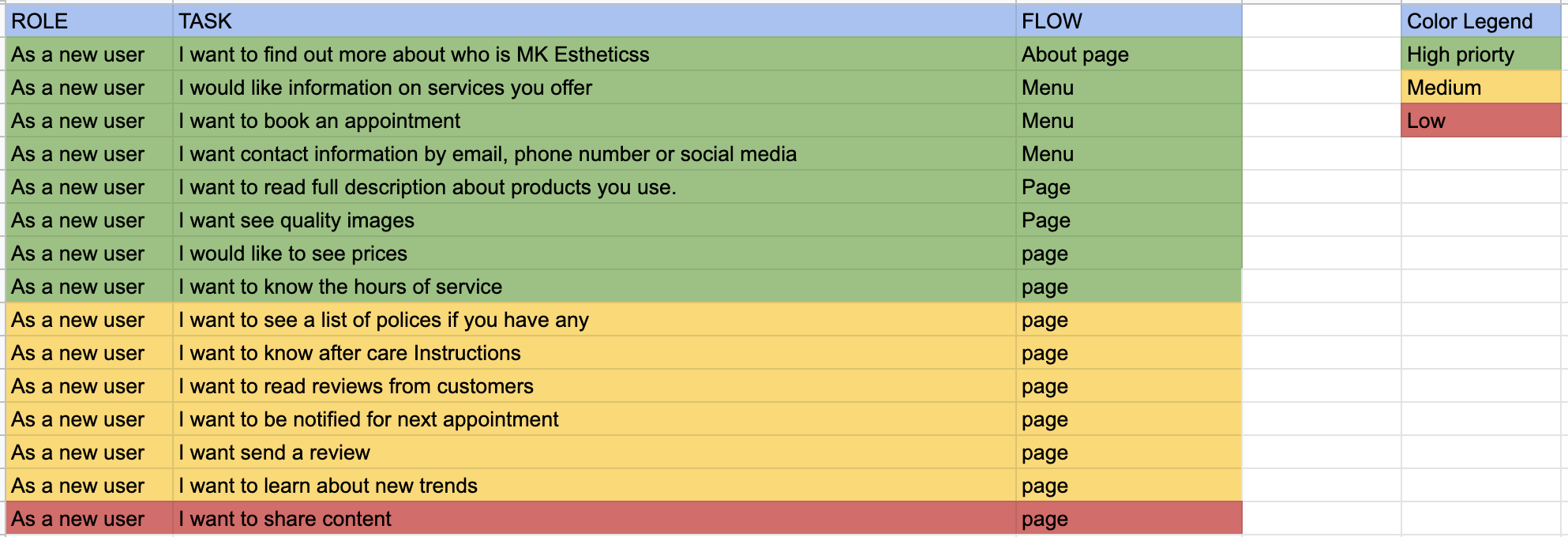
User stories
After summarizing the information from user interviews and data analysis, keeping my personas as a guide. Users created these stories.
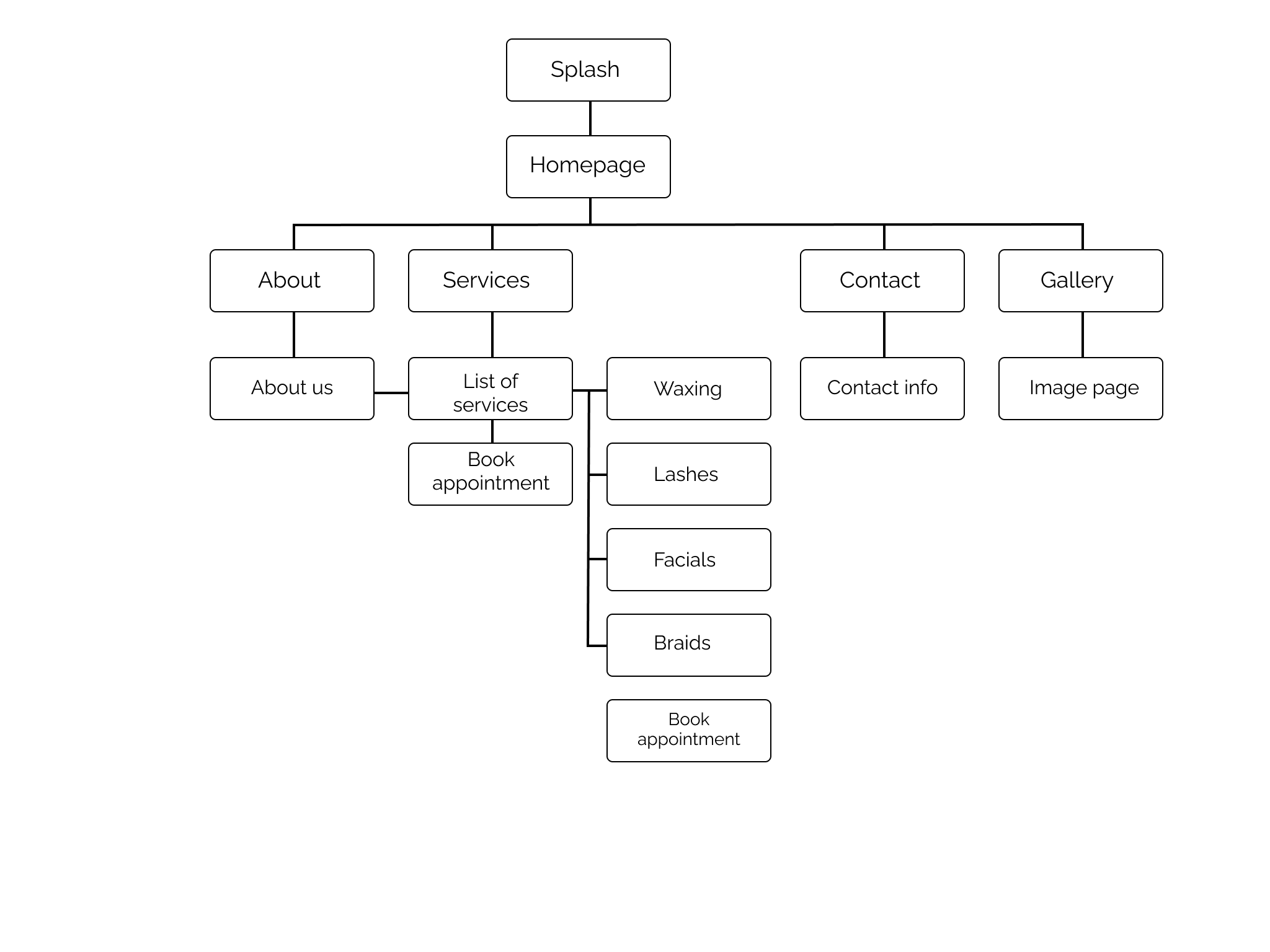
Site map & User flow
The site map gave me a clear picture of the navigational hierarchy.
I knew from researching my competitors that looking into their user flows would be important for later use. Creating UX flow helps me to understand the whole user’s journey and covering all the screens. From past user flows from previous projects, I remember that while shopping, people like to add to the bag and continue not to disturb their flow. The same opportunity, why not see the list and have the option CTA for booking right away, for returned users.
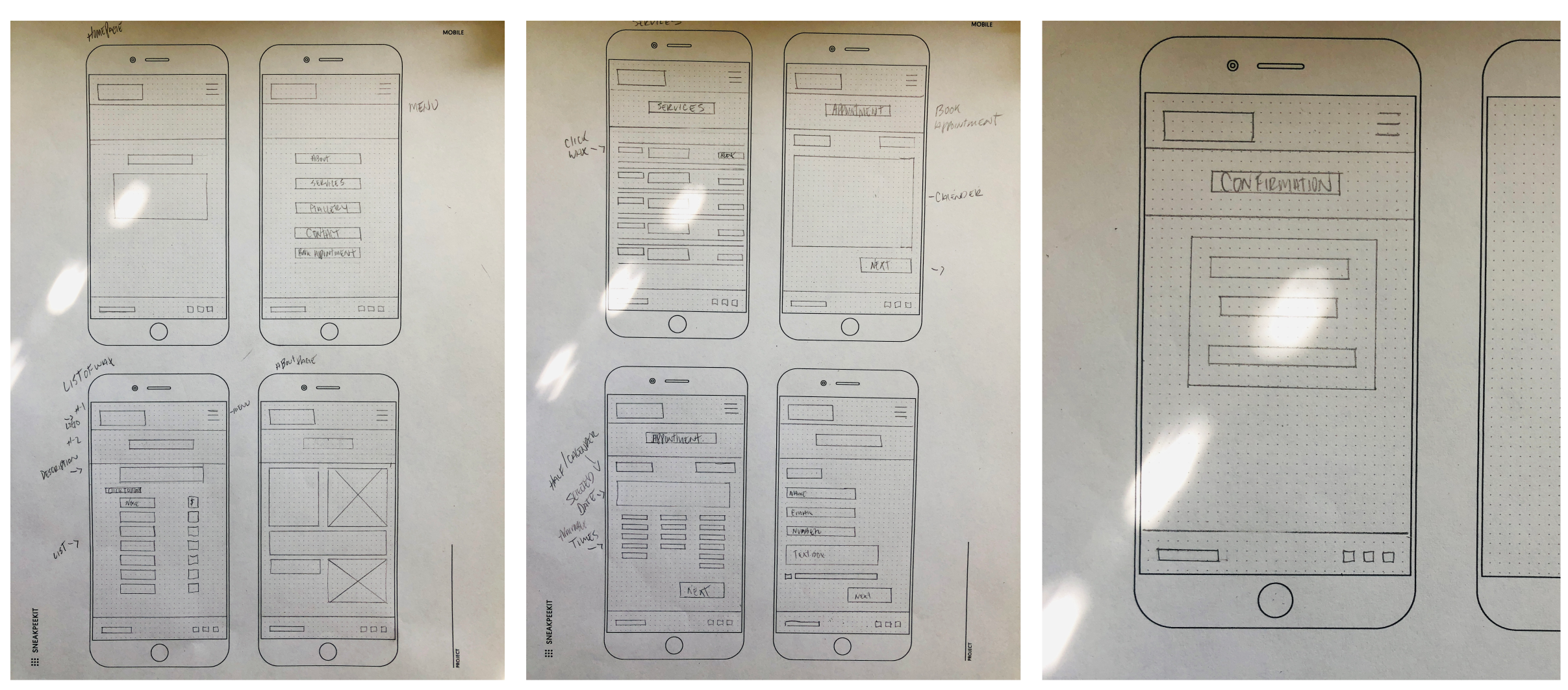
Wireframes
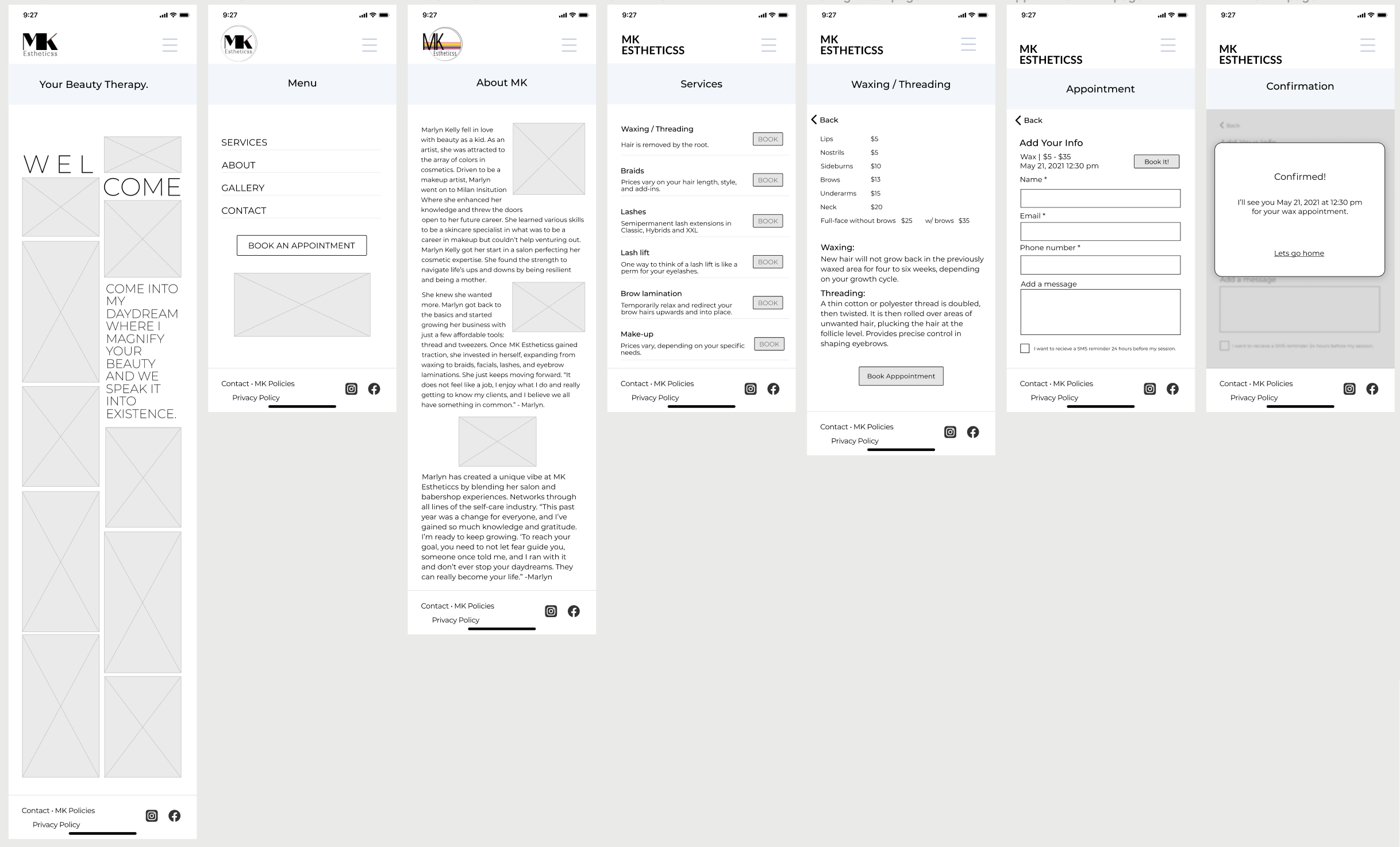
Before embarking on the wireframes I needed to create content to share information about my client’s products, services, and MK. Preparing document outline, updating content based on client edit requests.
Wireframe sketches remembering that being consistent with components in every page to not confuse the user.
In a more profound understanding, I went back to the 77.8% book through Instagram. I thought to myself, people, in general, don’t like change. I dug up in the Harvard law review I should try to minimize the number of unrelated differences introduced by a major change. Wherever possible, keep things familiar. Remain focused on the important things; avoid change for the sake of change.
If I can integrate some patterns and get the same presence to the app, it would help with not interfering with their mental model. Making it easy to move users to an app and simply adding what the users need.
“Try to minimize the number of unrelated differences introduced by a major change. Wherever possible, keep things familiar. Remain focused on the important things; avoid change for the sake of change.”
I went through a quick and easy way to test a layout and user flow with users. I was not specific on the scenario the first time around because they skipped the waxing description page. Asking why? They told me, I just told them to book an appointment, and they did it the fastest way possible.
It gave me an aha moment back to when I created my user flow. I knew returned users would know what service they wanted to book, which made it easy and fast without going through unnecessary pages. I'm glad it worked. But the tester suggested maybe after clicking the calendar date instead of clicking the CTA next, for the page to automatically continue to the next page.
Develop
Branding
I had a meeting with my client to ask the right questions.
• What her favorite brand is? what does she like about it?
• What is her go-to app or website?. what are her likes and dislikes.
• What was she trying to convey to her users? The world?
It's well known that different colors can have an impact on our moods, feelings, and even behaviors. Pink symbolizes youth, good health, and nurturing femininity. Targeting our users. I used the 60-30-10 rule. Using sans serif font, Montserrat to give it a modern feel, and Open Sans for titles, headings, and quotes.
The logo was a challenge. I Conducted a preference test with family, friends, coworkers they all chose the same logo. I tested it on others showing insights in my presentation to the stakeholder on how people see the logo. The ultimate design came from the client who told me to make the shades lighter and different color
Giving informational design best practices about accessibility issues. It wasn't a certain decision just yet, and communication was difficult. I continued for the time being.
Mockups w/ ideations
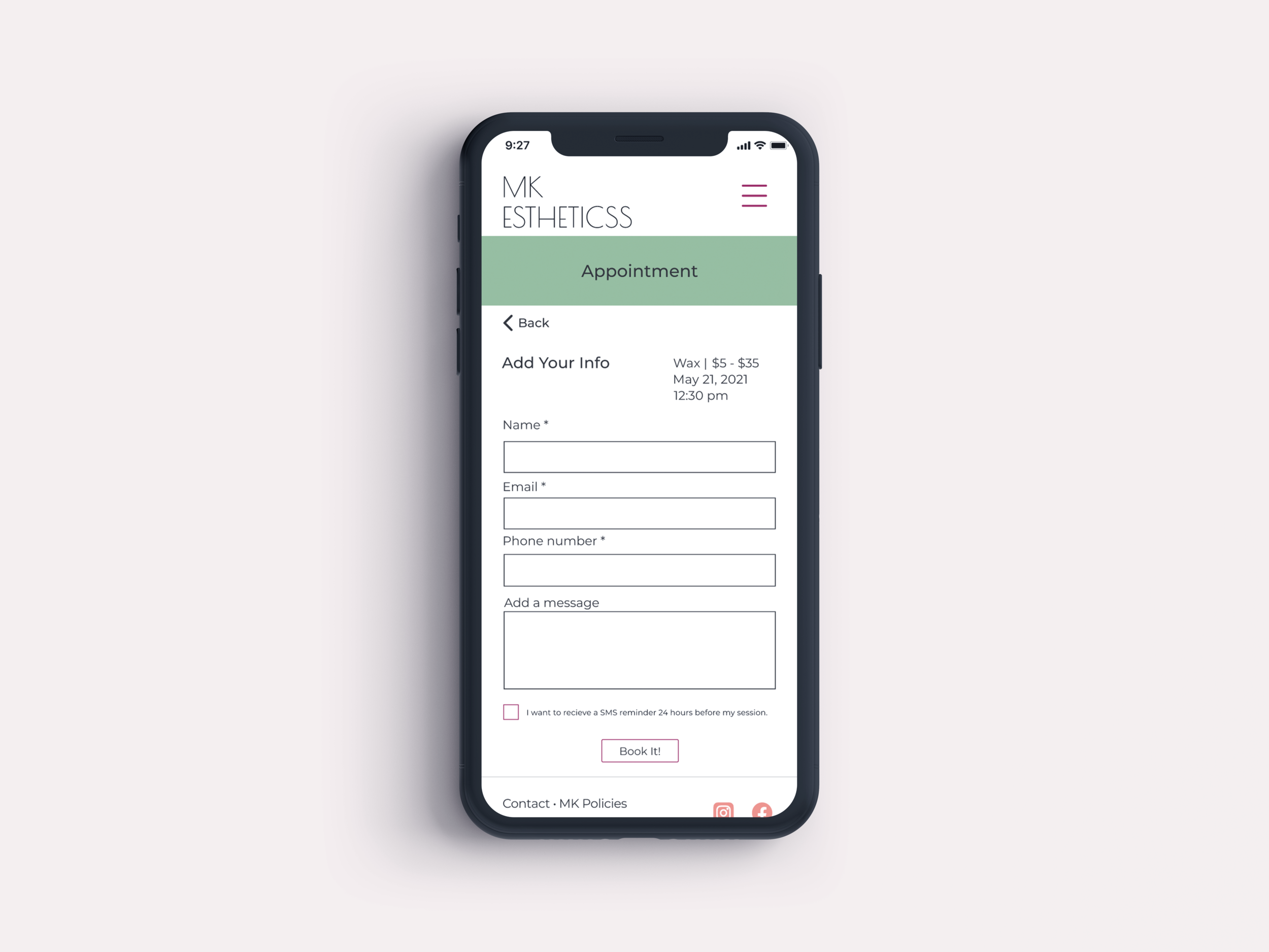
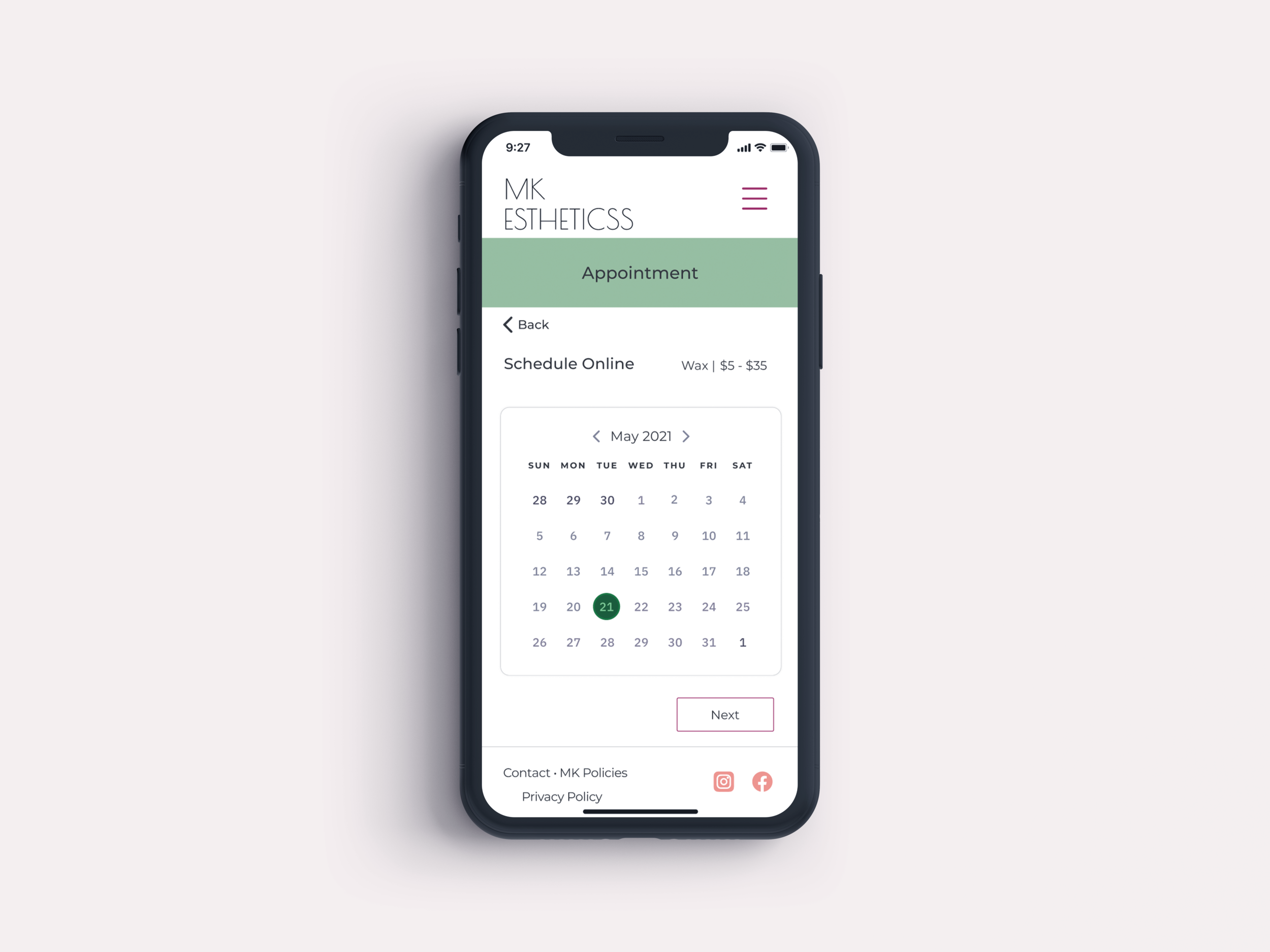
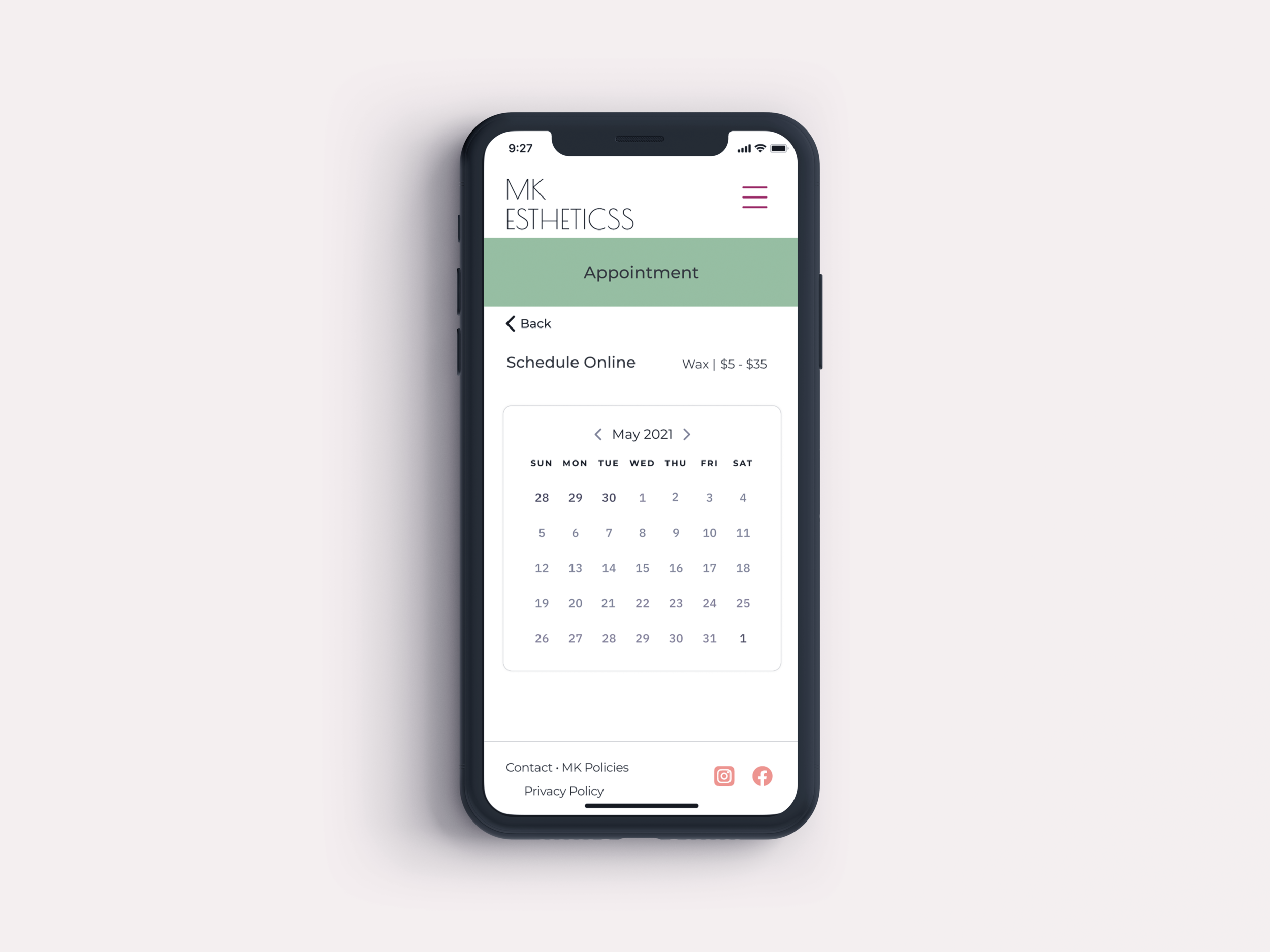
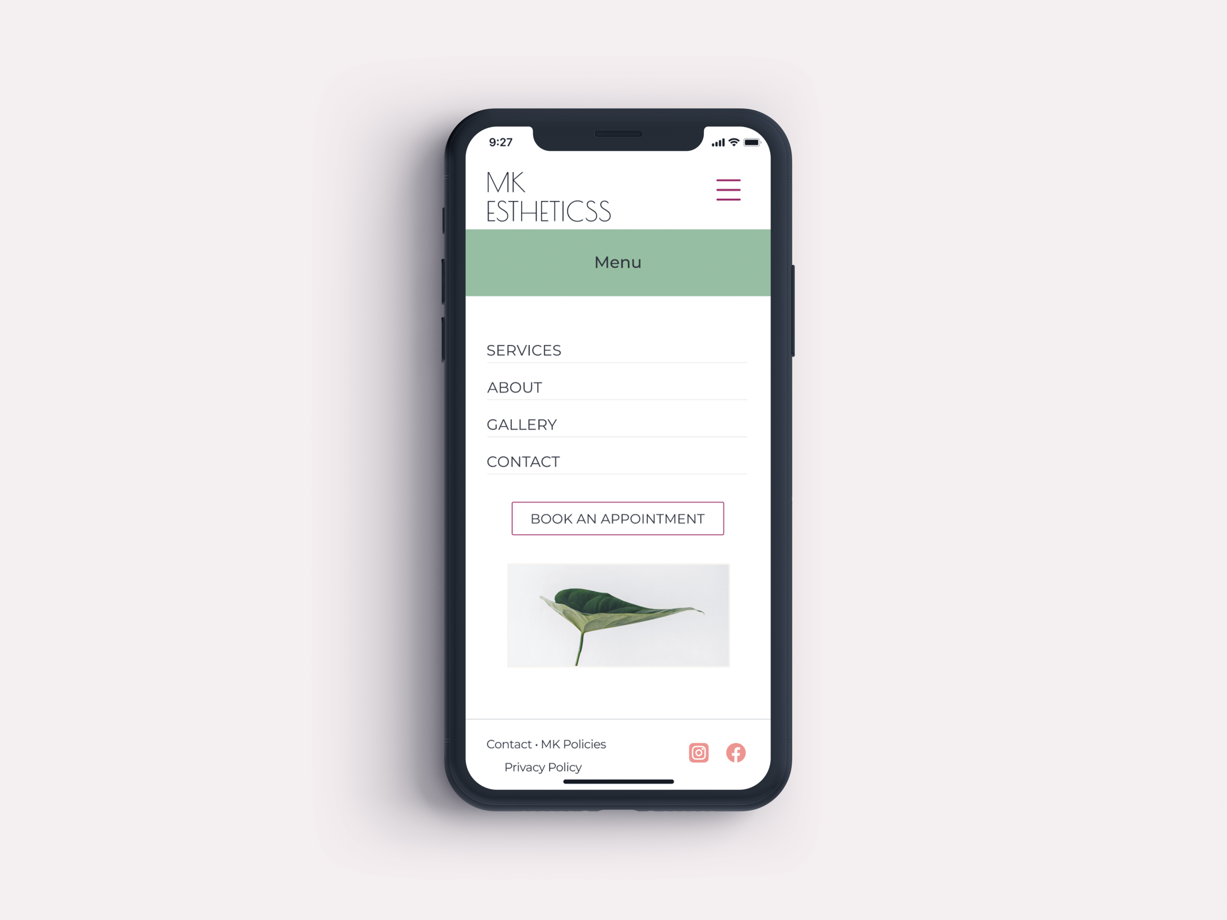
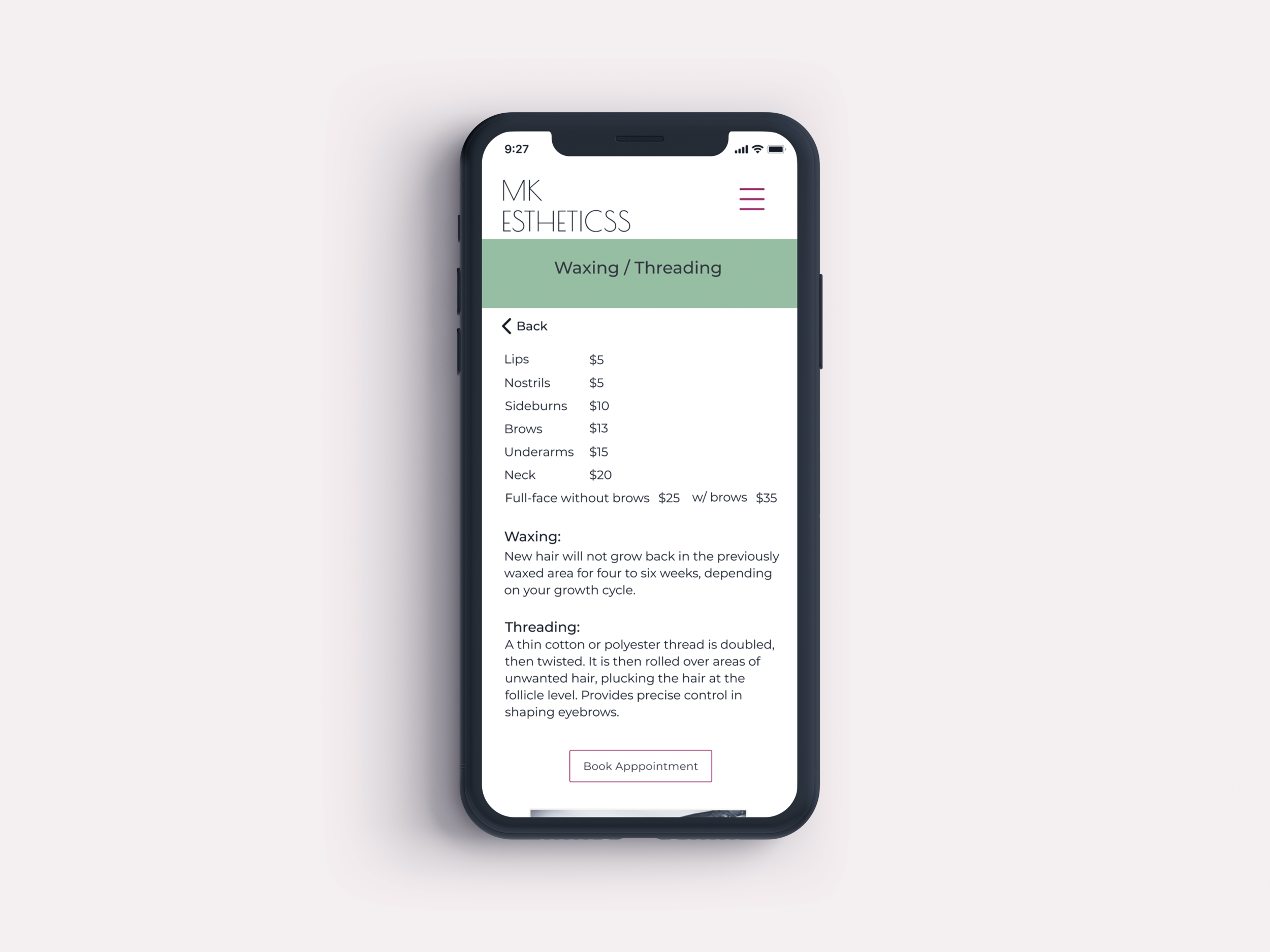
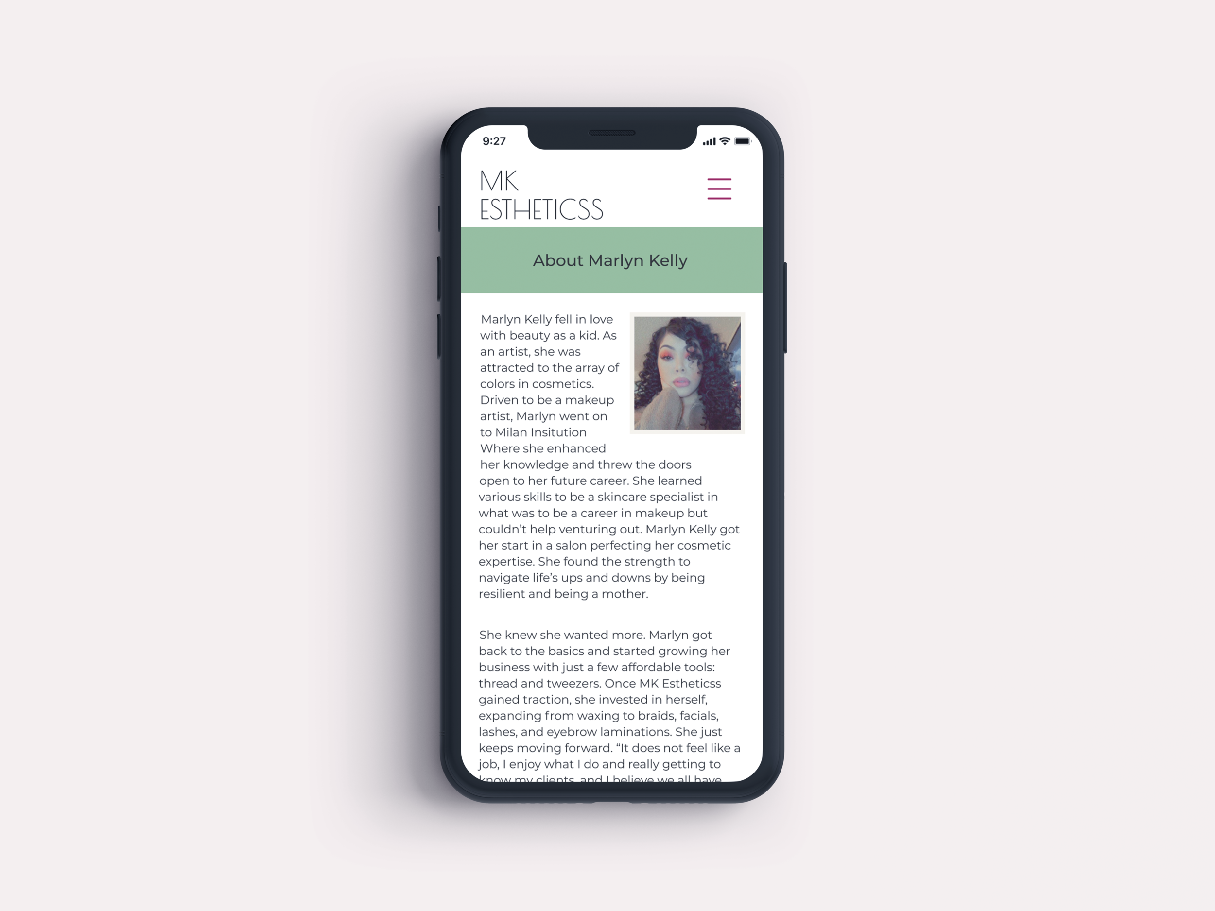
I presented the mockup to my client and the first thing that came out of her mouth was "is this a website?" Harsh reality but she is right, It leaned more into looking like a mobile-friendly site instead of an app. I was off track, and I love the feedback. I did research and started to add app patterns, remixing ideas.





Deliver
Usability test
The test’s purpose was to assess the usability of the mobile app interface design, brand Identity, information flow, and information content.
Participants
I contacted and recruited participants through MK Estheticss client base, tech-savvy and non-tech-savvy, to get various users from different backgrounds. Six participants completed a one on one session.
Evaluation Tasks/Scenarios
Test participants attempted completion of the following tasks:
Task 1 - Find the service page
Task 2 - Find the price for a nose wax
Task 3- Book an appointment for the 21st at 12:30 pm and reach the confirmation page
First screen tour:
I asked the participant to stay on the homepage for about 3 to 5 minutes to look around, talk aloud about their thoughts, how they feel, and if they knew what its use is. Their views on the overall look.
Results
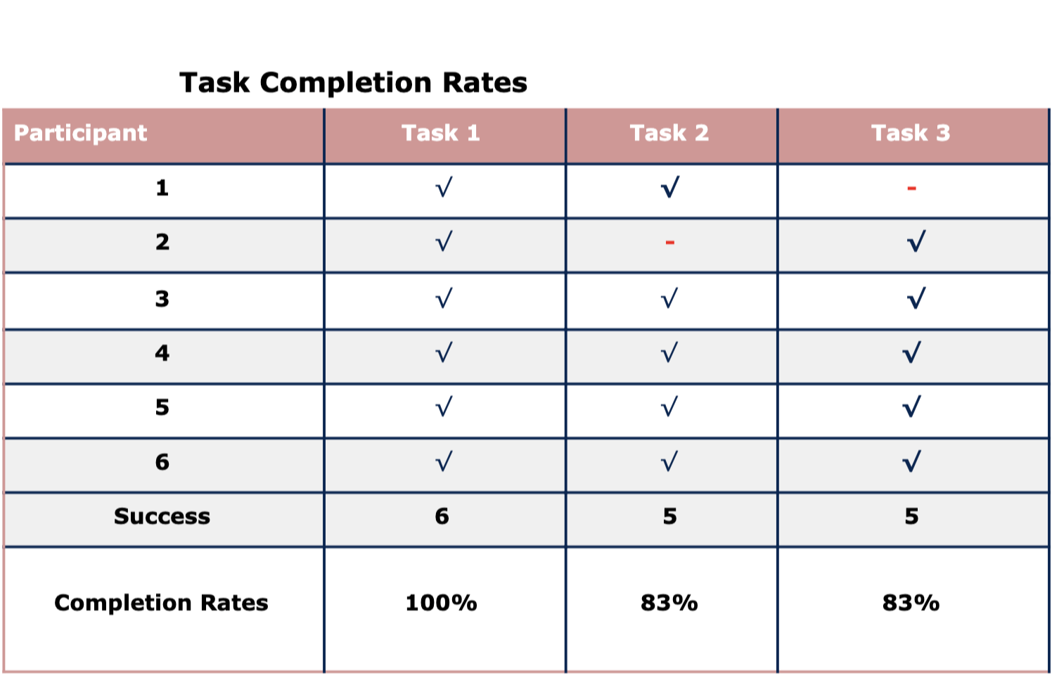
Task Completion Success Rate
6 out of 6 (100%) completed Task 2 (find the price of nose wax). 5 out of 6 participants ended Task 1 (service page). Approximately (83%) of participants were able to complete Task 3 (book appointment without prompting).
Summary
Upon completing the tasks, participants provided feedback for what they liked most and least about the app and recommendations for improving the MK Estheticss mobile app.
Liked Most
Ease of use liked how simple and clean it looked
Getting information quickly
The calendar and booking was easy
The list of prices and services
Liked Least
The following comments capture what the participants liked the least:
Need brighter pictures
Different pictures, need more typography choices
More brilliant colors on the app
Recommendations for Improvement
I need to do more research on typography. My colors are too dark, requiring a brighter overall feel of the app. Switch out some pictures.
After the completion of each task, Insight into what participants said:
“It was easy, better than most booking apps. I use.”
“As I was searching, I knew by other apps where I suppose to go.”
“Very informational.”
“I like the content.”
“I like to see prices and a list of services; it helps me decide if ill book an appointment.”

