midwest transit
Overview
January-February 2021A Transportation agency for a midsize metropolitan area has expanded a network of public buses. In need of a schedule application and system for newly added bus routes taking a broad, conceptual idea and delivering something valuable to city bus users.
Scope & constraints
Finding the most straightforward solution while considering the user’s needs, taking into account the primary core task of my business client's requirements. Due to time constraints, I couldn’t implement other user stories.
-
ROLES
• UX Design
• Visual Design
• Brand & Identity
-
TOOLS
• Figma
• Adobe Illustrator
Problem
• During the expansion of new routes, multiple buses stopped at the same stop, confusing the riders.
• Riders not knowing when exactly their bus is arriving or departing.
solution
• Enhance the user’s experience by giving the riders color-coded markers of each bus to easily identify their bus at Washington & State bus stop.
• Updating riders with live time stamps and route visuals to pinpoint exactly where the bus is located.
• Allowing riders to see when the next bus is coming by schedule.
DISCOVERY
Competitive analysis
I scoped out the competitors using a S.W.O.T analysis. I wanted to understand extensive metropolitan areas and how big cities operate with many bus routes. So I went with Trans stop, DC metro & bus, and Transit.
They have a copious number of bus lines since they are in big cities. Both have a cognitive overload on the apps when your working memory receives more information than it can handle comfortably, leading to frustration and compromised decision-making. Helping me decide how to differentiate the bus app to stand out and not follow suit in areas where they have issues and use what they exceed to apply to our mobile app.

Survey
While conducting surveys and user interviews, I must understand how bus riders use the bus to navigate the city and discover the bus schedules and routes. What were the challenges they faced when they didn't know the arrival or departure of a particular bus? What applications do they use when trying to commute? I research the apps they like most. How did they feel when accessing them? Was it with ease of use or difficult?
13 participants volunteered to help figure out my target audience and chose my interviewers. I completed two phone interviews (during covid) to answer my questions, and they gave me insights into their pain points and daily life of commuting.
I asked users what makes them not want to use a mobile app? To give me insight into what users feel.
• How it looks
• When they are difficult or confusing to figure out how to use.
• Logging in
• If the app has a paywall.
• How well I can see it, and how easy it is to use.
• Not up to date
• Theft
• I don't particularly appreciate having to put my information in for the app to be used
Takeaways
• Almost 60% find the bus arrival inaccurate.
• Users would like to see the bus on the route in real-time.
• Users wanted routes and schedules easy to read.
I pointed out how often participants used the bus because I needed to know how often they looked at the app. What kind of visual can I offer them while they wait for their next bus? Also noted in the survey are what mobile apps most people use because of how accessible it is and what they find challenging in all apps gaining insights to helping create a user-friendly bus app.
Journey Map and Empathy Map
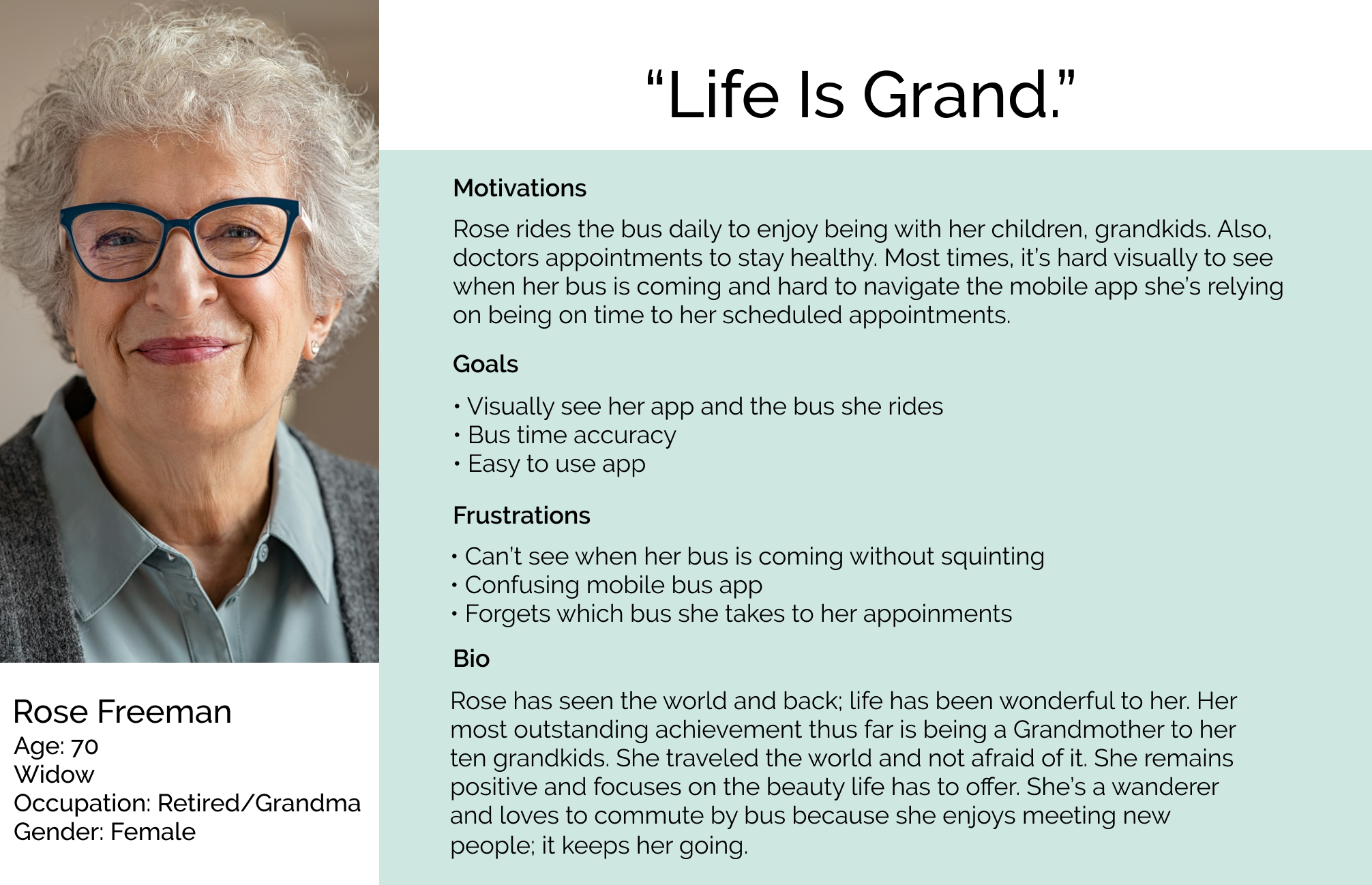
I went further in-depth; I immersed myself in the day of the life of a bus rider. I observed users' behaviors and empathized with the users, which helped with the journey and empathy map. I was a long-time bus rider for part of my life, so I resonate with my users. Simultaneously, the interview and observation allowed me to understand and empathize with the participants.
During my ride, observing and walking to the bus stop and going to work. It taught me how much you’re in your head that you want to look at your phone constantly. I wondered if I was going to be late for the bus or work. Just hoping the bus app is accurate on bus times. Reminding me to put my users first to make sure the bus app is Efficient and aesthetically pleasing to look at—bus ride details.
DEFINE
User stories and site map
Empathizing through my user research, I gained knowledge about my target audience. Creating a list of user stories that were most important in the minimum viable product. Ensuring that I understood my users, classifying the content tangibly and logically to understand and efficiently complete their goals. I even thought, can I put a mini-game app within the bus app? But I focused on the task at hand.
User flow
I began building the user flow. In a much more concise flow, the user can see bus details. The alerts appear right on the screen next to the bus line letting the user know if their bus arrives soon or leaving the bus stop. You can add favorites to alert you of your specific bus. Also, lets you choose from the seven color-coded bus lines that stop at Washington and the state.
Wireframes with iterations
I developed wireframes to visualize the content elements and pages. Once I sketched, it helped me Identify gaps, understand how a user interacts with an interface, and determine the layout positioning of graphic elements. It gave me great insight and a handful of ideations.
My main goal is not to overload my users, with functionality; an all-map design to be the focal point helps the user not get distracted by other small details. I remember to use my persona as a guide. Short and to the point. Simplicity is key. Users already live in a busy world, and I wanted to give them a breath of fresh air on an app.


Prototype
Bringing wireframes to life by creating a low-fidelity prototype. I did a qualitative usability test to see if a user can use it the way It’s intended or if I need to adjust or redesign it. Once tested, I came across several usability issues. The live tracker was confusing for most. Also noted by testers, I needed more pages. I ideated my wireframes and even went back to my user flow. I added the required adjustments for my users to have a better experience with the Midwest App.
• I put an Enable location wireframe
• I visually redesigned the time tracker screen that gives you how long it takes to walk, bike, and ride the bus to your destination on the map, Instead of a confusing page.
• Visually enhanced most of my layout.
Develop
Branding
To give my users a visual identity, Image, and personality on a Mobile bus app. I looked at my competitors and some outside resources but mainly focused on my target audience and my sense of design to combine and incorporate it into MIDWEST TRANSIT.
CLASSIC • MODERN • EFFICIENT
Two words, Retro Chicago. I am mixing Classic with the Modern era. Brand positioning is critical; I wanted it to look and feel young yet act mature, keeping my target audience in mind. Efficient, well-organized with minimum effort. I want my users to see Joy when they have to ride buses every day and look down at their phones. A minimalist app makes it easier on the eyes when dealing with noise all around you—creating a mood board to keep the design consistent and bringing it to life.
Typography
Avenir has a geometric structure that I was looking for to make the app feel light and modern. Helvetica, It's legible and neutral. Both are sans serif, a readable Typeface. conveying simplicity
Color Palette
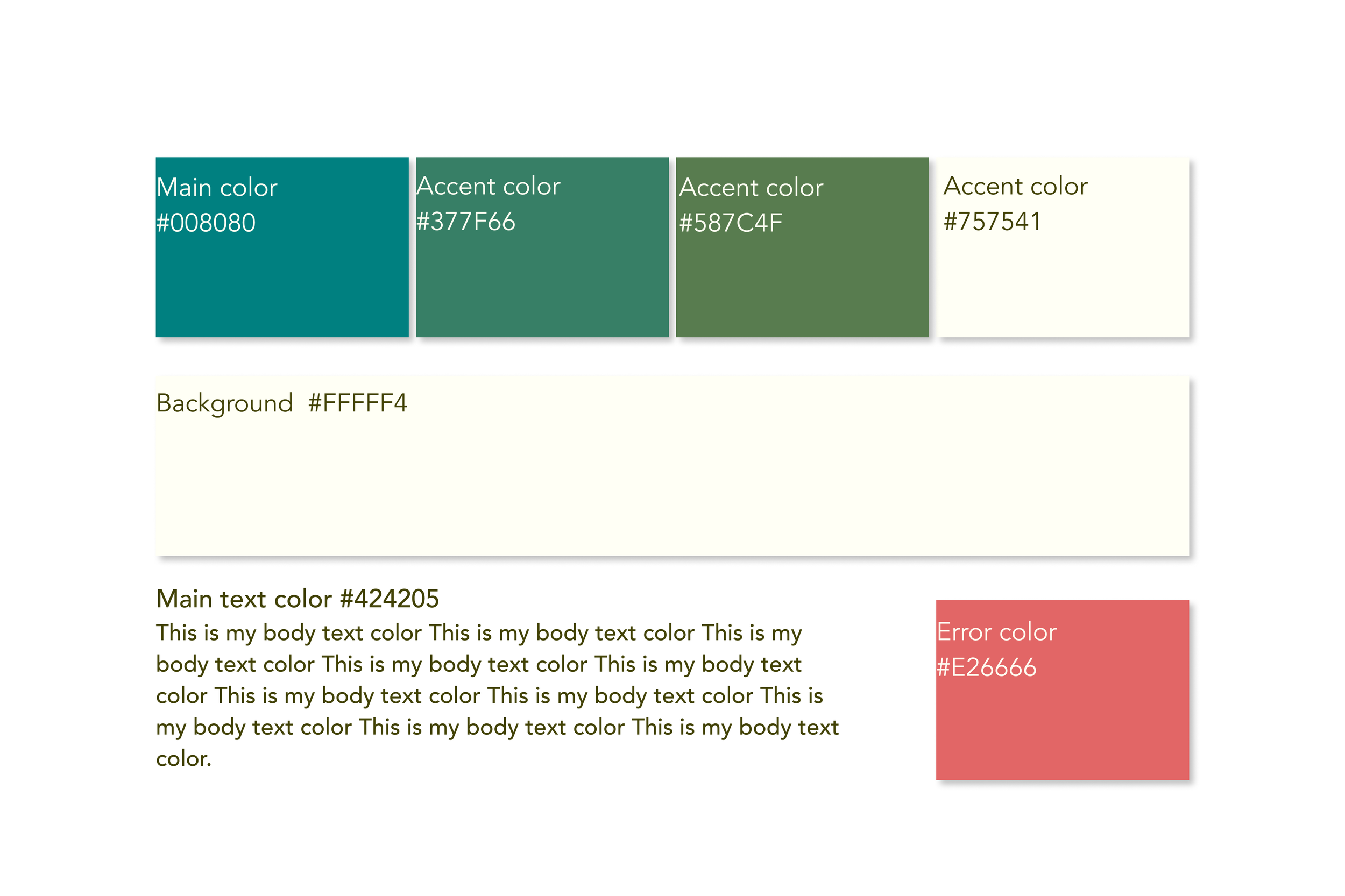
I chose an analogous color scheme. I mentioned I wanted to create a unique app. These beautiful colors work well together to set a tone of a classic yet modern feel. Easy on the eyes, evoking feelings of purity and calmness with warmth.
Logo Design and Process
The City of Chicago. What is a better focal point for MIDWEST TRANSIT than the city itself for its bold architecture and skyline punctuated by skyscrapers. I conducted a quick preference test with family, friends, and designers on which design logo they liked.
Prototypes (with iterations)
Minimizing options not to overload the user and promote clarity, and ease of use. Implementing MVP, business requirements, and users at the forefront of my design. To speed up the design process, I used Figma UI kits, yet I also designed my own custom elements to add my style and give a unique look which you will see in the final prototype.
DELIVER
Usability Test
I refined my prototype by doing another qualitative usability test for observational insight that identifies the ease of using the app's features, UI design, and ability to do its required job, giving the user a fantastic experience. I made a usability report from my participants.
Goals
The goal of the usability testing is to put my Bus app prototype through a series of small tasks and test its functionality and usability for our users. We want to answer our business requirements. Ensure that any user can tell when each bus arrives at the Washington & State bus stop. All users can tell how much time they have to get to the Washington & State bus stop before the bus they need arrives at that stop. Allow users to select one of seven bus lines to see a list of its future arrival times at the Washington & State bus stop.
Questions
Prototype questions that we need users to answer. They are the following:
Are riders able to Navigate the bus app with ease of use?
Can you tell when each of the buses arrives at Washington & State bus stop?
Can a rider figure out how long it takes to walk to a certain stop?
Can the rider figure out when the next bus is arriving at each stop?
Can the rider find the settings page?
Method
The method for this usability testing is a half-day of moderate 1:1 user interviews and in-person testing. I will be voice recording just in case I missed anything.
Observations


Results
Outcomes and Findings
• Like the visual of the app
• Participant was able to use the business requirements
• One person did not like dark mode
• It was a little difficult to find settings
• At search page participant couldn’t figure out how to exit
• Functionality is present
Final prototype

Final thoughts
The business requirements proved to work effectively based on multiple iterations of its final usability test.
Learning user research methods and using the most appropriate tools for gathering specific information is essential. Having empathy and understanding the users' mental model was prominent in this Mobile App. Most people use transportation apps with a common goal to get to a specific location. I let the users, business requirements, and being a natural observers guide me.
This was my first project. It was a huge endeavor and the time it took to design. (It’s never done.) I was learning the process and getting to the outcome. As the only UX/UI Designer on this project, I gained more knowledge in design thinking. I’m a pretty self-aware human, but a few things that I’m trying to practice are trusting my intuition, making sure I research my assumptions, and articulating hard-to-grasp feelings; I feel more than I can express, something I need to work on defining them into my designs. I would love to start using other tools in UX for my next project.


