“ We believe we are all connected individuals.”
Overview
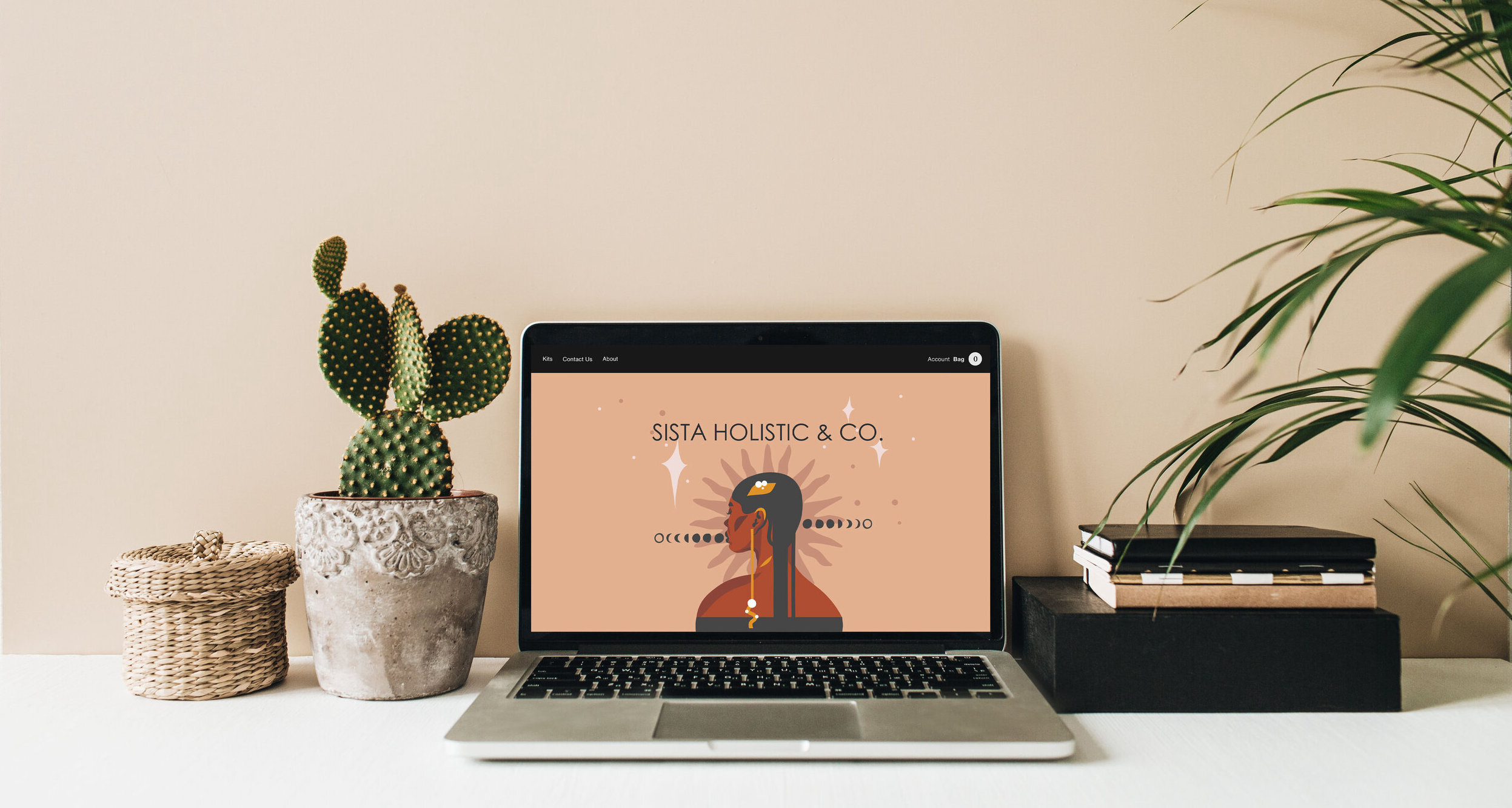
A modern eCommerce start-up company that takes the guesswork out of holistic healing by selling packaged kits and providing seamless movement throughout its content.
The problem
To start her business on the right foot, we need to come up with the solution of how we can sell healing kits while educating our users on how to weave them into their daily life, add an item to the bag, and make it to checkout, all while doing it seamlessly.
Audience
Cultured users seeking a new change in life and willing to do the work to enhance their lives to a state of peace, In a modern online shop.
Role & team
UX Research and UI/UX Design with my client's vision by my side.
Tools: Figma & Adobe creative suite
Solution
We needed to gain loyalty and return use, user engagement time, and depth. Research and sketching made me realize that content is just as important as seamless user flow for our users. Friction was our enemy since this is a new company, we need not disturb our user’s mental model for us to gain customers. We created an intuitive and consistent interface., We tackled cognitive friction. We understood our user’s pain points, what goals while interacting with our product, also how they want to achieve them. We identified our frictions by ideating, and more ideation with a design sprint to validate them quickly.
Discovery & Research
Target
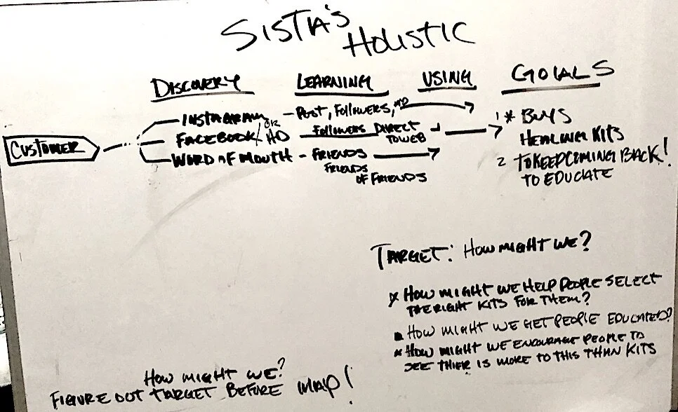
To solve our target, we started at the end. Enlisting the help of design sprint aficionados. Interviewing my client to know the hows, whys, and whats, gaining insight into their long-term goal. We mapped the challenge from discovery to goals using HOW MIGHT WE'S. We came up with the target: Creating an uninterrupted journey to buy healing kits and get our users to the checkout.
• Long term goal: In two years, build a community of self-healers.
• Can we get the trust of our users?
• Can we make it simple and clear to reach the checkout?
• Can we educate users online about self-healing?
• Can we build a community?
Research
Collected data and conducted user surveys about the pros and cons of shopping online, users’ pain points, the question of website or app, and why? Also Collecting insight from [ProProfs].
Pain points:
• Lack of product information preventing users from making crucial decisions
• User flow is inconsistent
• Receiving incorrect order
• Lack of payment options
• Slow-moving check out process
• Unimpressive user-interface design
• No customer service/ Help
Website or app?
60% of users chose the app if they use it daily.
40% of users liked the website if they were new to the site, one-time shopping, or big purchases.
Web:
• Websites give users an all-around view of the brand.
• Landing pages are the first impression for our user’s fantastic way to convert leads.
•Websites can be Mobile friendly and can adapt to different devices.
App:
• Users spend far more time browsing the mobile internet in apps than mobile websites.
• Apps are typically 150% faster than websites.
•Amongst the top ten most popular apps are eCommerce apps
Competitor Analysis
I need to understand my competitors’ positioning, strengths, and weaknesses to separate my clients' products and create a unique site for our users
Sage Goddess:
Strengths: Over 300 thousand followers on Instagram, very engaged with users, reward system
Weaknesses: Website has cognitive overload, it was hard reach check out, I had to add to cart to be able to buy. Then needed to scroll all the way down to find my cart.
Opportunities: Healing and spiritual living is on the rise = potential partnership
Threats: Target audience may not have time to view all the products
House of Intuition:
Strengths: Online zoom classes for $10, available in multiple retail locations, and easy to reach check out. Has an accessibility page.
Weaknesses: Social media sites are not updated regularly, drop down menu hard to read.
Opportunities: Zoom classes can equal partnership
Threats: No refund policy
User persona
Name: Monique
39,
Director for volunteer
services
• Motivations: She needs a change of scenery from her daily life
• Goals: Would like to be educated in living more spiritually, easy to use, and accessible
• Frustrations: Doesn't know where to start, annoying email clutter, and bad description
Name: Gabi
25, Full-time student/Nanny
• Motivations: Loves to browse new shops, can purchase and
practice in the comfort of her workplace or home
• Goals: Learn new ways of decreasing stress,
easy to purchase and simple to browse
• Frustrations: No time to read a lot of information; it is never easy to check out, pop-up menus.
Takeaways
We knew from the long-term goal we wanted to secure a community of self-healers. Gaining customers and building a brand is crucial. Insight from our research says it’s the first impression that gets you to the landing page and then the product page.
Talking with my client, we decided to create a website, making sure it was accessible through a mobile viewpoint. Listening to our user’s main concerns gave insight into how the user flow and content are significant; it directly impacts a company's revenue.
Analyzing our competitors gave us the inspiration to learn to grow with our user interface, content and guided us in the right direction. The do’s and don’ts of reaching to the check out page. Ensuring to stand out from the competition.
“Think of it more as publishing instead of marketing. Be authentic as a publisher and create content that helps you connect to everyone else...because they're already connected.”
— Mitch Joel
Journey map
We gave a visualization of our users’ and buyer's process to accomplish a goal on our website.
Informational Architecture
User flow
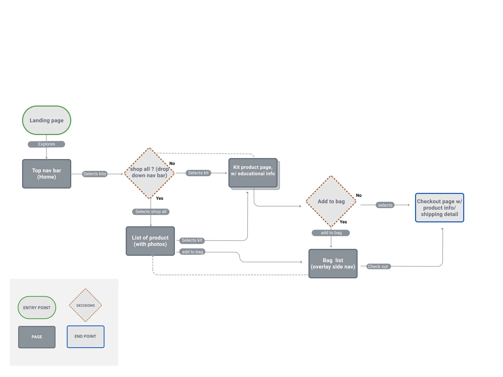
We collected the user stories from our target research and personas that help guide us into creating a structural design.
Lightning demos
Creating a new experience, I looked to existing design solutions as inspiration. I started transforming and combining parts to make something recognizably different from our competitors.
Four-step sketch
I embarked on a process called 4 step sketch design to solve a product challenge by generating creative solution sketches.
Notes:
• I have collected key information on my target research and what I learned about the product to incorporate it into my solution sketches.
Ideas:
• In the second step of the sketching process, I created doodles to visually highlight parts of my notes to make them more tangible.
Crazy 8’s
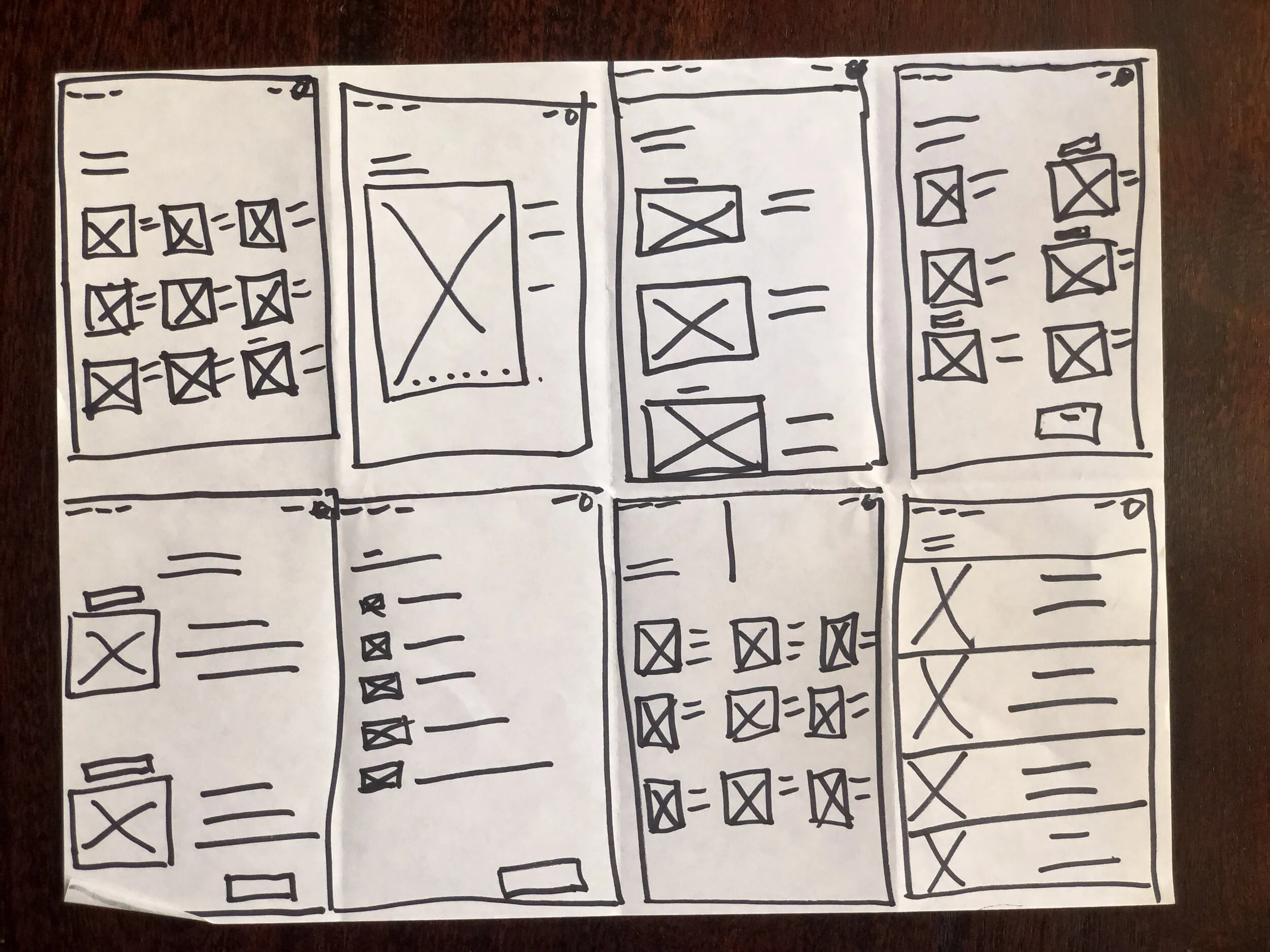
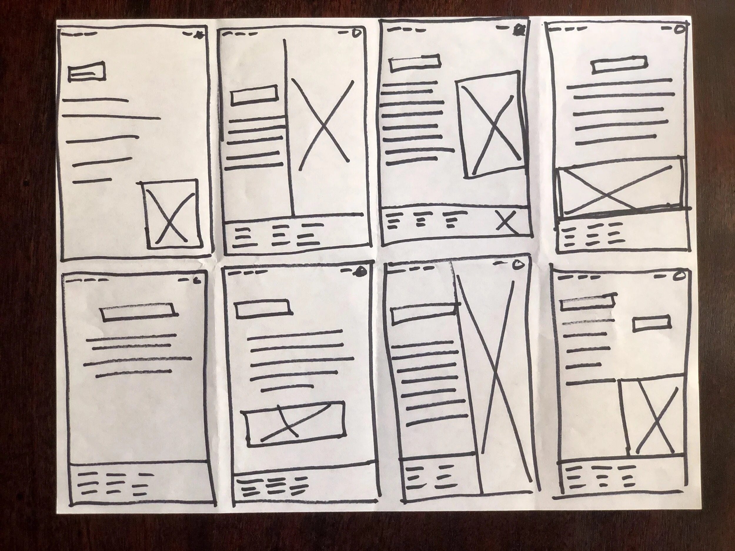
• Creating multiple ideas off the cuff in under a minute for each sketch, generating a wide variety of solutions to my problem. Afterward, I'll show my work to my client to analyze and assess the best competing solution. And yes I sketched these in mobile pages and used my imagination to create them in site format.
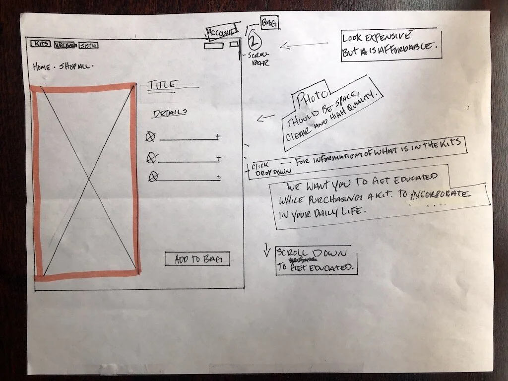
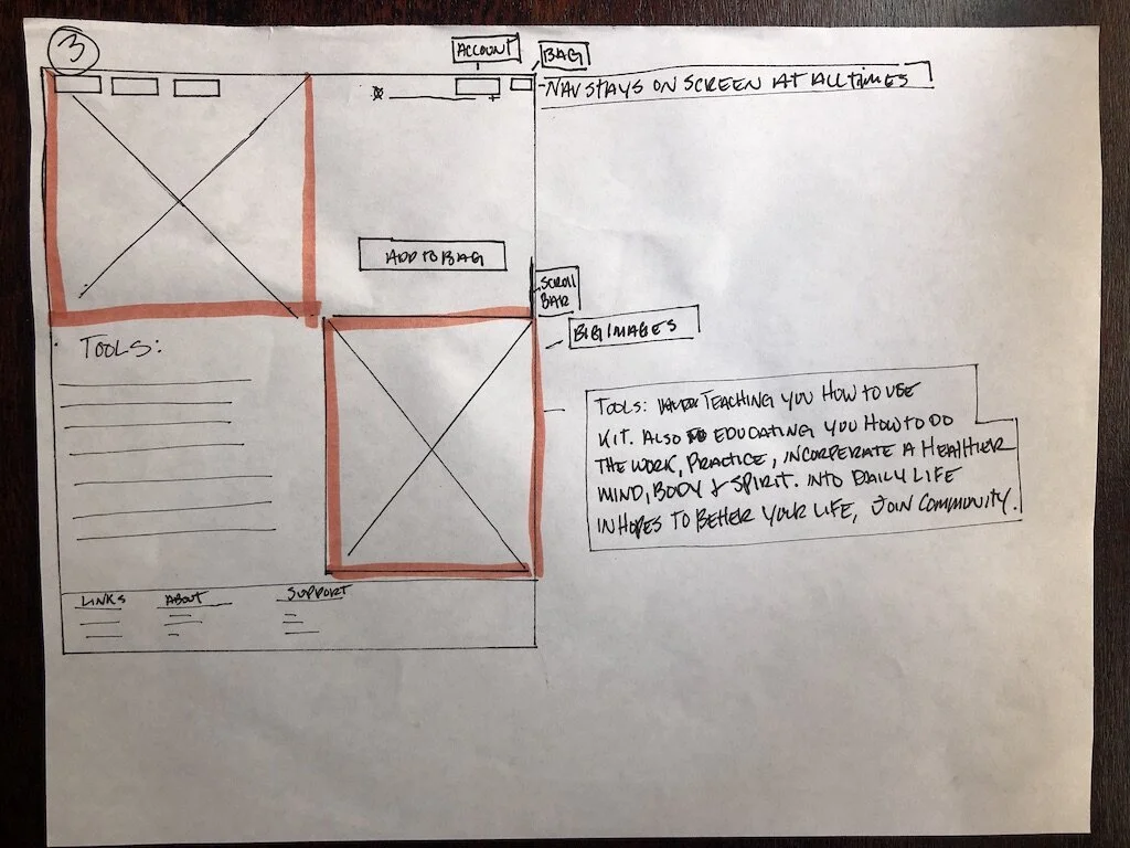
Solution sketch
• Choosing the detailed solution sketch, based on the variations from crazy 8’s, we chose the best fit for our long-term goal. Due to time constraints, we exclusively focused on high-impact pages. I will create wireframes, and prototypes always keeping accessibility in the forefront.
Storyboard
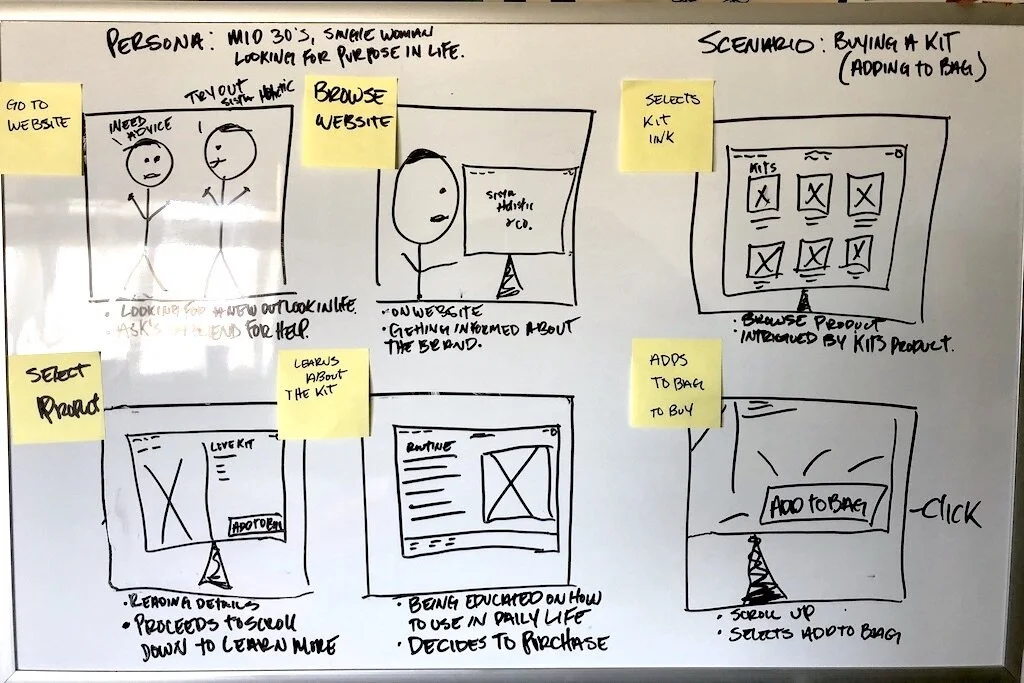
I took the winning scenes from my sketches and communicating a story by crafting a storyboard through images displayed in a sequence of panels that chronologically maps the user’s main events giving my client a visual.
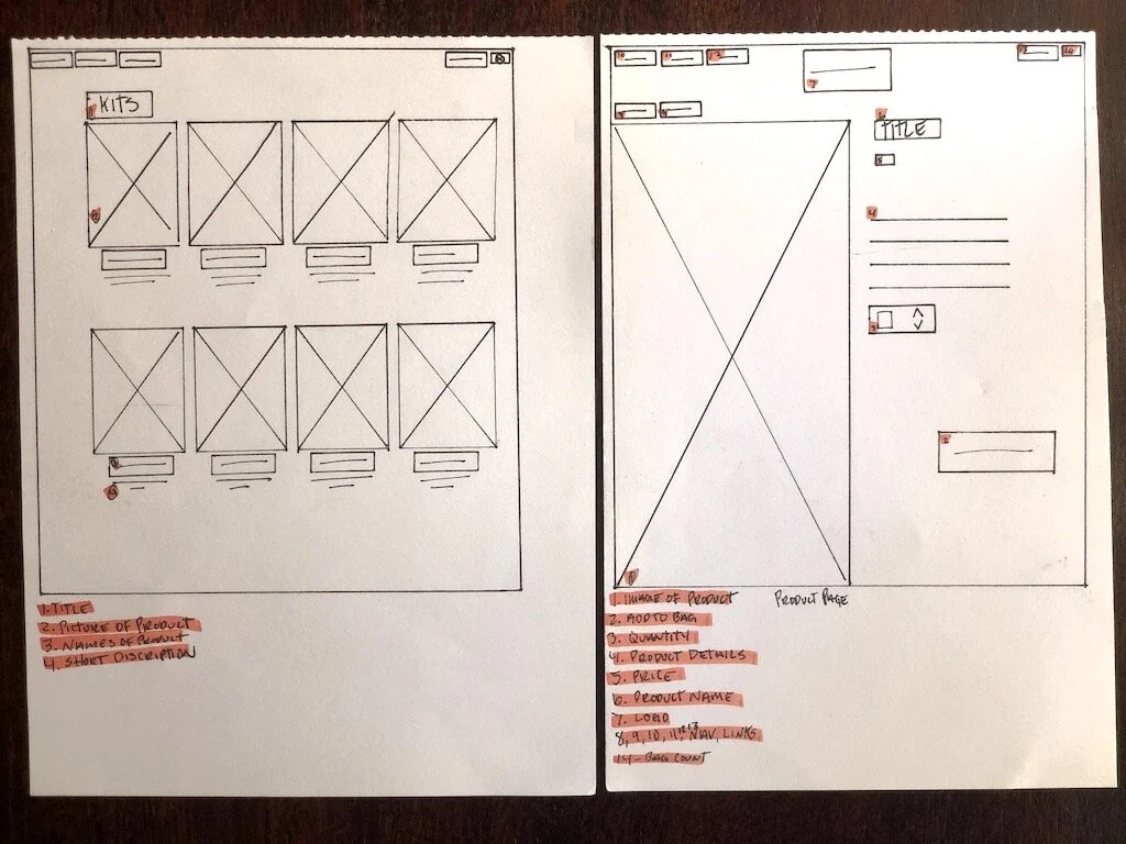
Wireframes sketches
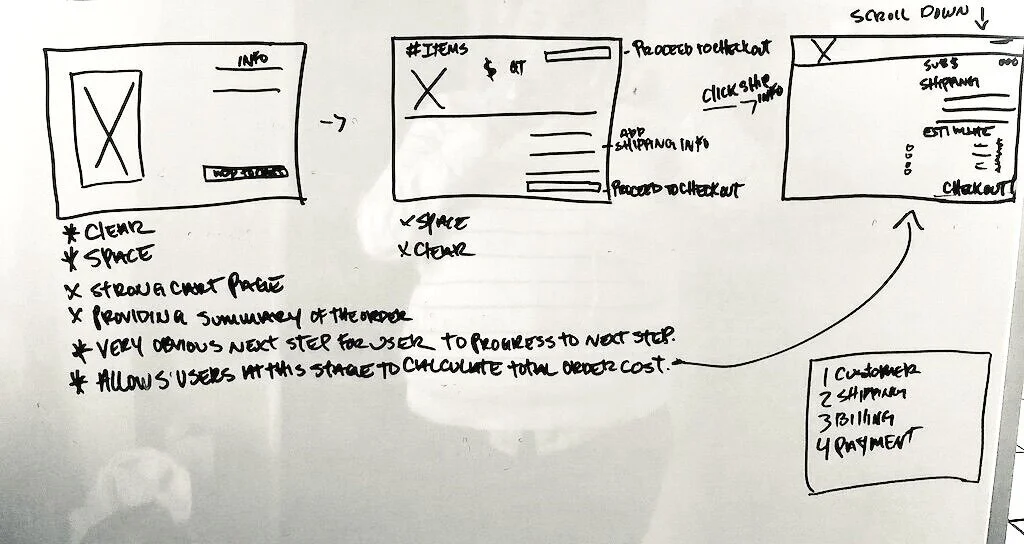
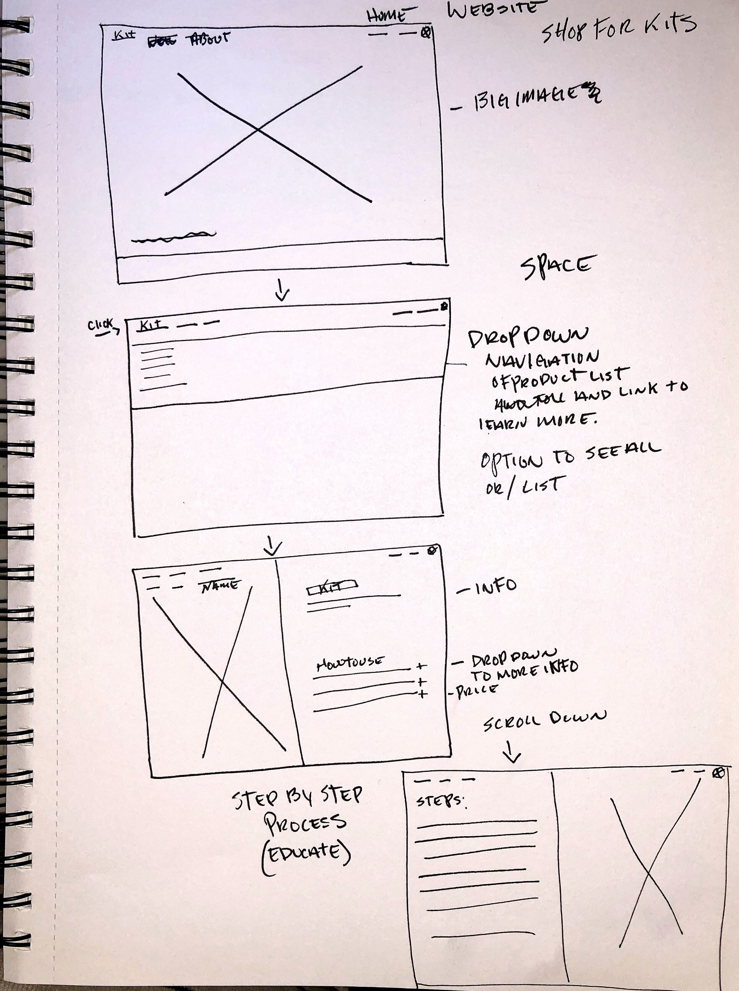
To communicate our structure I sketched wireframes, dictating the path a user will take to reach the checkout page. I then went to my team to see what their feedback was to make quick revisions.
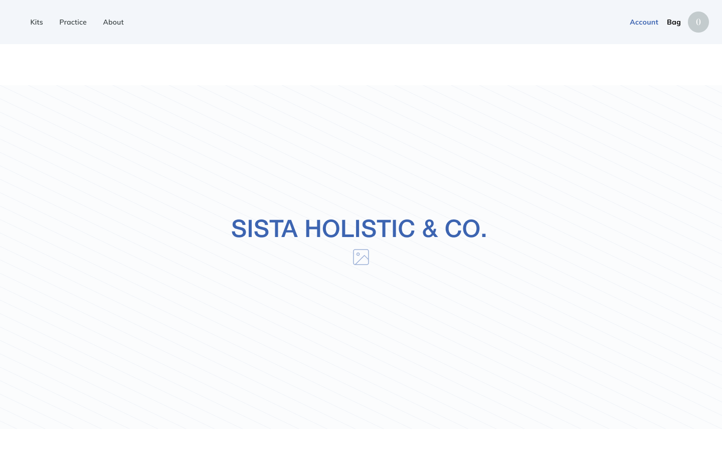
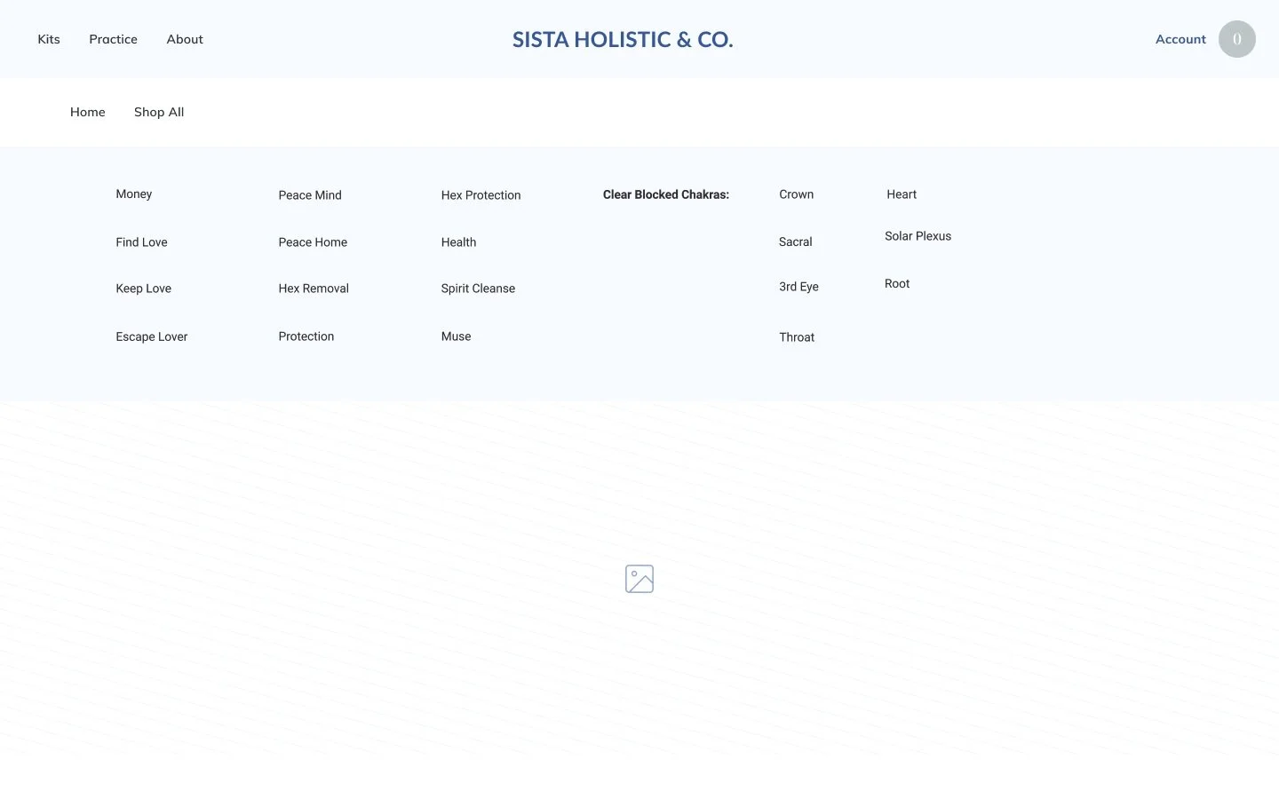
Digital wireframes
I conducted a quick paper prototype evaluation to get rapid results. Going through multiple ideations, I created clickable digital wireframes to map and position ideas.
Suggestions:
• Add a bag icon to the picture to quickly add and keep browsing.
• Drop-down menu content needs to be cleaned up.
• Inconsistent elements with product description page and informational page. (picture was on the left and the other on the right.)
• More CTA’s.
Usability test
We began seeking out qualitative data with explorative and evaluative usability testing. We gave 5 users realistic scenarios to complete, which helped highlight any gaps.
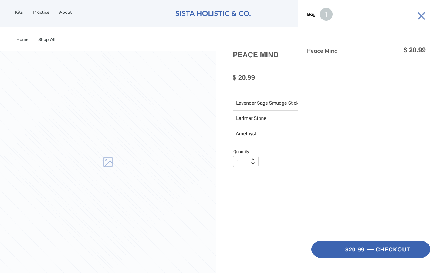
Scenario: to browse for peace of mind kit, add to the bag and check out. We wanted to see if we created a frictionless path to the checkout page. Since we know a high rate of drop-offs is right before or at checkout.
Goals
The goal of this usability testing is to put our prototype to the test. We want to answer our sprint questions and validate or invalidate our assumptions with real users. From this user testing, we will have gathered insights from users and validated our ideas.
Questions
We've got a mix of sprint questions and prototype questions that we need users to answer. They are the following:
Sprint Questions
Can they find the peace of mind kit
Did they learn about the kit?
Is check-out easy?
Prototype Questions
Did you find anything confusing?
Would you use this site again?
Did you get stuck?
Was the product easy to add to the bag?
Do users understand what this product or service does?
Method
The method for this usability testing is a day of moderated 1:1 user interviews. We'll be using it In person.
Participants
All Five participants are Friends, Family, and Mentor.
Results
The user testing resulted in the following results.
Next steps
Iterate on the usability issues we identified during testing.
• I took out the email sign-up for now; the placement wasn’t right.
• One user didn’t know where the informational page was, not sure if it was the user or our issue. I will continue to test.
• Fix the drop-down menus cognitive overload to make it a cleaner look.
• Start branding and researching the checking-out process.
Sista Holistic & Co. - Final thoughts
We successfully got users from the landing page to the checkout with ease after multiple Ideations; It was challenging at times since I had the long-term goal in the back of my mind. I was enthralled by the project and what it’s trying to convey. I jumped the gun and wanted to start building a community, asking users to join without knowing the product just yet, which was not working. I did not know when to insert an email to join our community. The beginning? the end? The flow confused the users.
During this project, I was surprised by my users; receiving critical feedback makes me work harder. They gave me much-appreciated insight not only for the prototype but insight into how users think and feel while using technology. Emotions drive us. I learned so much about e-commerce; it’s on a different playing field. The whole experience of trying to build an online store is challenging, and it suits me.
I love a good challenge because of the time constraints I needed to move forward. Everything is a learning experience. I have no doubts that this product can succeed; I hope to continue to grow this project.
